Microsoft just announced their new CEO today
Here’s the page:
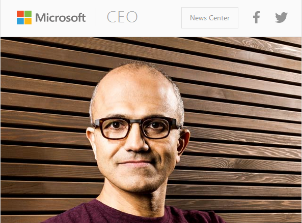
Satya Nadella – Microsoft’s CEO (microsoft.com)

There are a few things I really like about it
- Use of White Space – The whole page feels very clean and open, and the white space draws your eyes to the text, videos and images in the content. There are no distractions
- Great Use of Responsive Design – Try this: expand the monitor to fill your whole screen. Now look at the image at the top. You’ll notice that Satya is centered in the picture. Now, open the page up on your phone. Notice that the image STILL has Satya in the middle, but that it has changed so that it’s not just a shrunk, smashed version of the original. If you open a web browser on your laptop and slowly shrink the size of it, you’ll see the attention to detail just in that picture. Similarly, the entire page re-flows cleanly as you shrink your browser window. Notice what happens in his bio area (the 6 bullets that start off as 3 columns and 2 rows at the widest).
- Motion on Hover – The play buttons on the videos already show that you can play them. When you hover over the videos, there is a slight zooming effect – which may not be a standard, but I like it. Anytime I see some kind of change on a page (such as a word changing color when I highlight it) it makes me think I can click something. I don’t really like that all the links are in light grey and non-obvious, but that seems to be the flat UI style that is becoming more popular – I have the same concern about iOS 7.
Now, what do I NOT like about it?
- Lack of consistency. That page is great – now click on any of the links (such as the Press Release). Now you feel like you are on a totally different site.
- Lack of Headings – I think there could be some more breaks under the section titled Meet the CEO. It’s a big wall of text. They do have a couple quotes to break it up. I also think it’s kind of strange that the big pull quotes come right after the paragraph where the quote is used. I would instead use it as a heading above the paragraph, or some variation of it.
- Video Style Clashing – These Youtube videos on a Microsoft site look funny. I get that they want to increase the number of views on the videos so they rank higher in Google, but the different fonts in the video player, the bright red color of the play bar to me look really bad. That’s a big reason I prefer Vimeo – no branding, clean player, and completely customizable colors.

Leave a Reply